Give Millennials a One-of-a-Kind Customer Experience
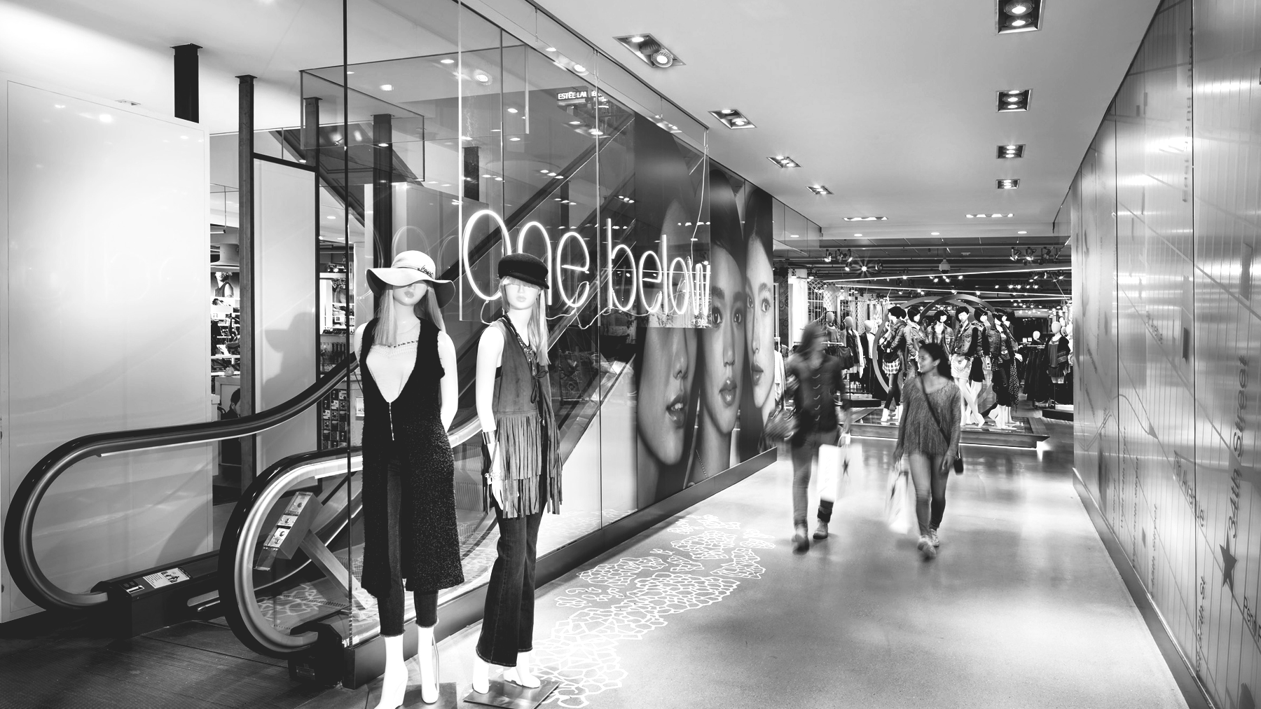
One of the largest department stores in the world had been partnered with my team for their in-store technology in Herald Square for years. Aside from unique screen configurations throughout the other levels of the flagship, most concepts were relatively homogenous brand marketing messages.
They came to us with a bigger, and somewhat open-ended challenge – create a truly unique customer experience for younger shoppers. Macy’s knew that a digital experience could help satisfy this need, and I was excited to help enhance the customer experience in such an iconic location.
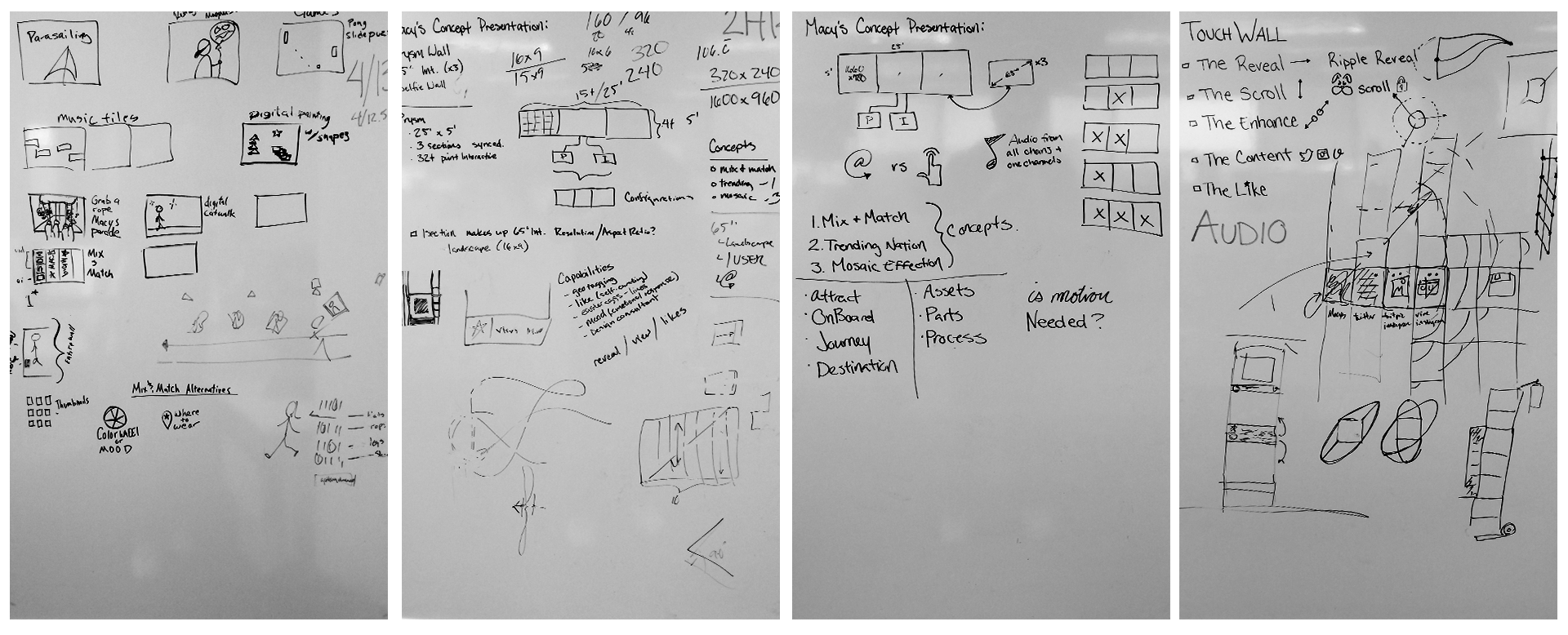
Whiteboards and sketches are integral to my collaborative design process development of complex solutions.
Approach
What is your target audience doing?
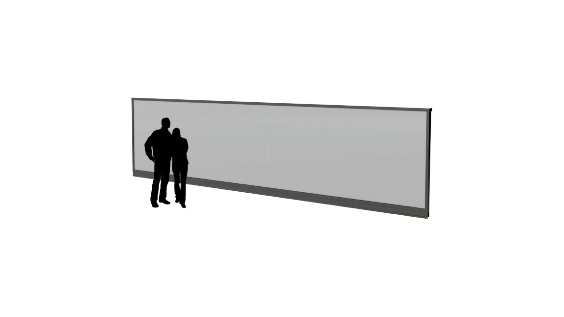
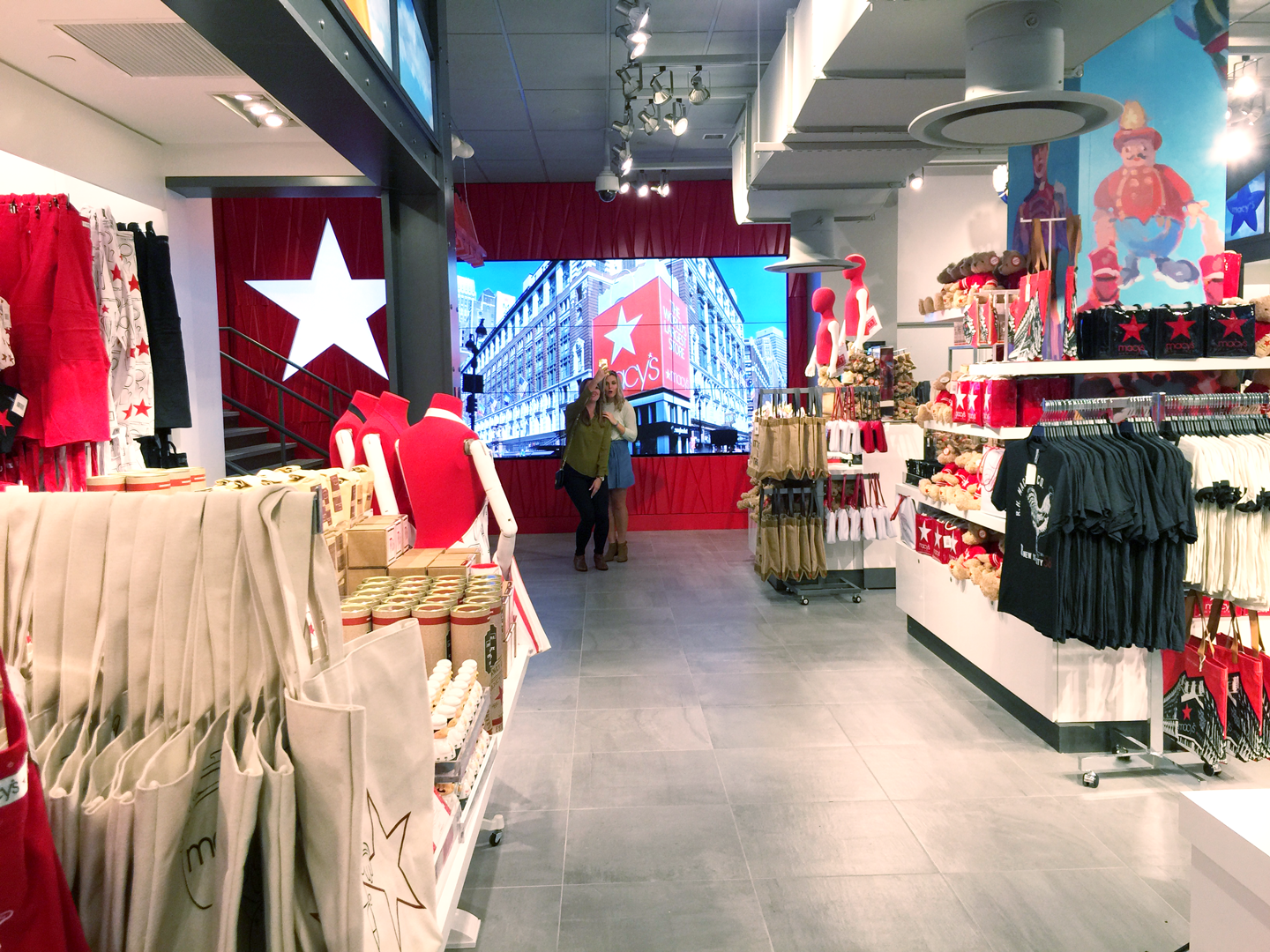
The client already had in mind hardware that would make a huge splash, even if it just played content without interaction. A 25 foot by 5 foot wall with a touch overlay was our canvas with which to work. We assumed the physical limitations of the hardware, and began to research the environment immediately surrounding the experience.
Some important usability thoughts we strived to solve at the start of this project were:
What is the viewing distance, PPI and how will the experience need to be tailored for the scale? Touch screen experiences differ greatly with scale, so being aware of the speed at which interactions take place, and that viewers are both at arms length, and across the room from the experience.
How wide is a comfortable distance away from other users? With 32 touch points, the interface needs to be truly multi-user friendly.
What height range do the interaction need to lie within? Does the UI exist where a touch engages, or is the entirety of the app the interface with which to interact?
What sort of content is viable? What sorts of experiences could stay fresh without having the client incur more of an operational cost?
Scale of the physical experience is important when deciding the content, comfortable viewing distance, and style of interaction
Our team surveyed the physical space and strategized on what actions may be taking place nearby. Due to the wall’s proximity to fitting rooms, we concluded they a)may be lounging on nearby couches waiting for someone to try on clothing or just charging their phone b)may just be passing through the area or c) they may actively be looking for an opportunity to engage with the Macy’s brand by snapping photos in the landmark tourist destination the Herald Square store has become.
Following the journey of potential users within the space, we created profiles that fit within the browsing habits of millennial shoppers. This resulted in experiences that could fit into one of three potential silos:
Social
Share your finds with #macyslove. Explore and interact with curated posts in a mosaic
Discovery
See what is trending in other cities and browse exclusive Macy's looks
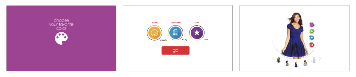
Utility
A digital outfit finder with endless aisle suggestions and filtering based on mood and purpose.
Initial UI Design (Utility Concept) - How do we attract, interact, and assist multiple users simultaneously with a utility style application?
We followed the path of the user from attraction through “conversion” of each silo. This helped us communicate possibilities with clients that eventually made the determination: the space and experience would be best received if it aligned with our social experience. This would allow for the most potential concurrent users for our 32-touchpoint overlay as well as give us the ability to leverage a platform that Macy’s was already using to curate a feed on their website.
User Interface Testing
What does the experience look like when not interacted with?
Will a logo be too low resolution to be legible?
Would the grid work with full-frame photography?
We began prototyping what the experience really looked like before interaction, the overall interaction design on a single-user basis and also worked towards solving the difficulties for a multi-user interface at the appropriate scale.
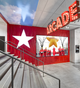
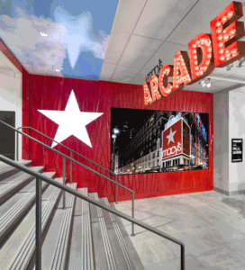
Selfie Wall
As a popular form of communication with the demographic, the selfie is the quickest way to share where you’ve been, and how much you’re enjoying your surroundings. With an emphasis on social sharing, we created a selfie wall in which customers could “select their own surroundings”. This concept builds on Macy’s history and importance in NYC, as well as provides customers to enjoy the Macy’s thanksgiving day parade, year round.
A secondary benefit of this accompanying experience is while it end-capped the “Macy’s” branded gift shop area, it also served to feed the content of the touch wall by encouraging customers to use the hashtag #macyslove
Results
At launch the Macy’s social wall helped to create a major PR buzz for Macy’s Herald Square location. Articles in both print and web publications mentioned both the Social Wall and the Selfie Wall experiences as true innovation in retail experiences, for the millennial tourism market, that Macy’s Herald Square so proudly personifies.