Spence Diamonds – Case Study
Design, design thinking, creative, creative thinking, creative leader, creative leadership, graphic design, Dallas, designer, experiential design, design evangelist, creative evangelist, creative speaker, design speaker, design judge, design consultant, creative consultant, user experience, user experience designer, ux, ui, user interface,
15573
portfolio_page-template-default,single,single-portfolio_page,postid-15573,bridge-core-2.3.6,qode-quick-links-1.0,,qode_popup_menu_push_text_top,qode-theme-ver-22.2,qode-theme-bridge,wpb-js-composer js-comp-ver-6.7.0,vc_responsive,elementor-default,elementor-kit-15961
Spence Diamonds – Case Study
Situation
Innovative, Ethical and Beautiful Product Requires an Environment in New Markets.
Spence Diamonds came to us with a unique angle on the jewelry retail experience. They wanted to appeal to a younger, more socially conscious and tech-savvy market, while still being able to tell their luxury brand story.
Being able to serve up digital content was one way to bring more energy and life into the space, but being able to relate to a shopper in their life journey as well as their path to conversion, is something that traditional in-store marketing cannot do.
Approach
Collaboration through multidisciplinary teams
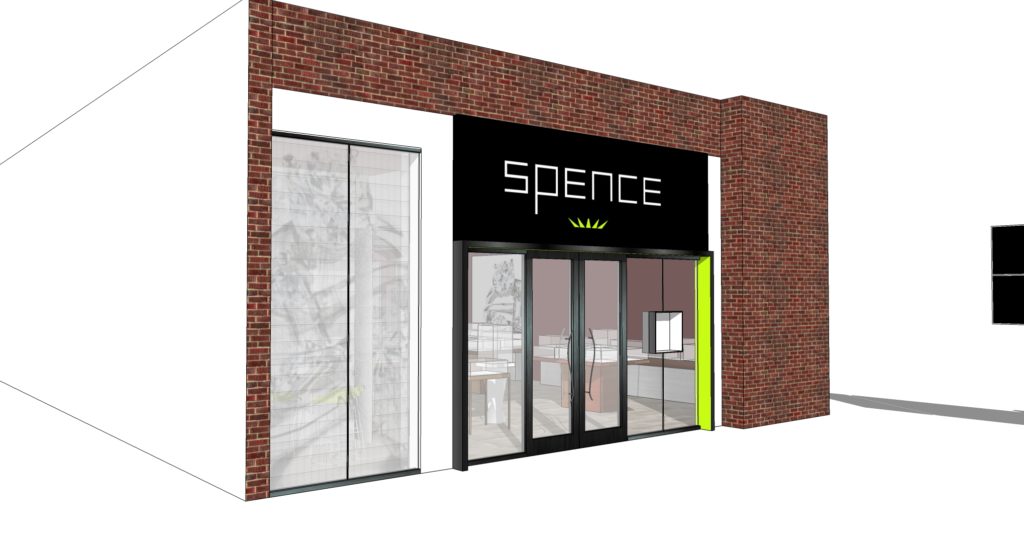
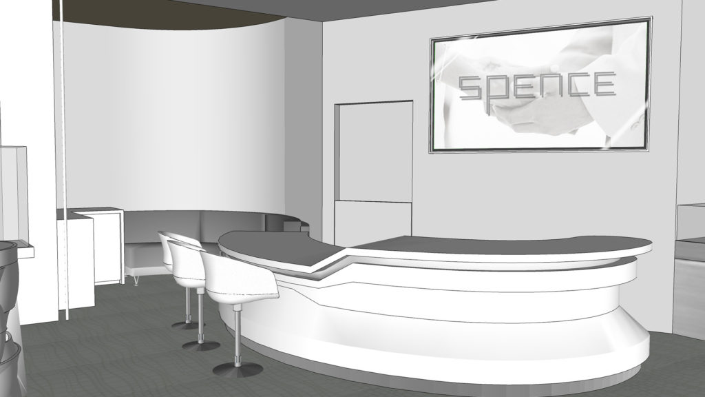
I worked in collaboration with the store design teams at JGA. We used their early renders to concept our digital experiences.
The client did have some ideas of technology that they thought they wanted, such as an LED net in front window, which we included in early renders.
Early Renderings from JGA
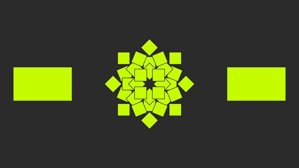
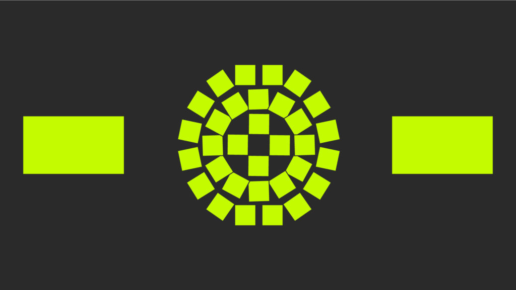
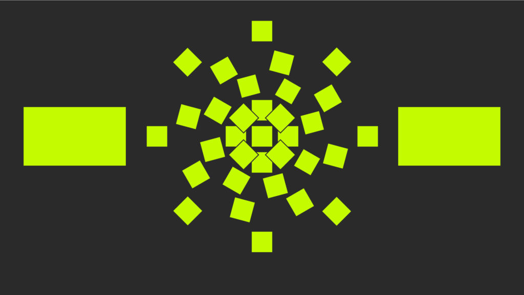
One of the main concepts I wanted to work with was playing off the faceted nature of the brand’s logo, and product. I set this as a rule for displays we installed, to create something that stood out from the street, but also could be used for story-telling, promotional, and environmental motion within.
JGA’s approach was then changed by the concepts we gave to them. From small layout changes to entire wall finishings, the inspiration for the customer experience was a two way street.
Both of our team concepts adjusted slightly after the first round of collaborative design. My team was working through types of potential story-telling content as well as trying to pin point which configuration would be within budget and even more importantly scalable. Spence is bringing their brand to new markets all over the US over the next few years, and this store design serves as a basic template for future iterations.
I also worked with engineering to see what sort of screen configurations were budget conscious or even possible in the physical space.
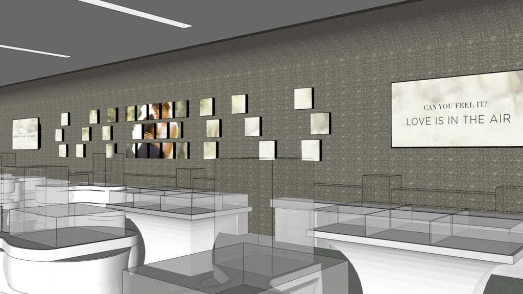
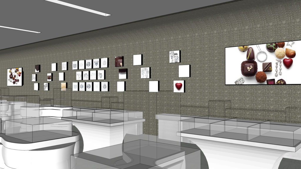
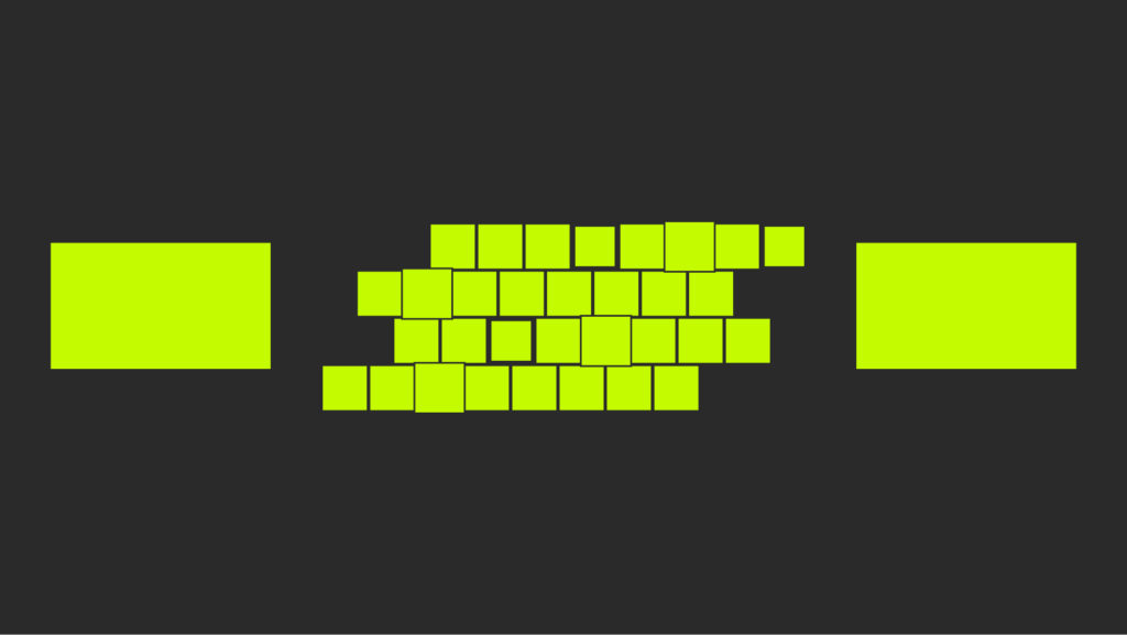
What we discovered in the phase is that while an entire wall of mosaic tiles give the store a “wow” factor, there are a few factors that make it not feasible.
Firstly playing with the depth of the screens make it uncomfortable to view while directly in front of the cases lining the wall.
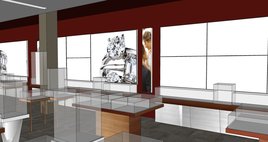
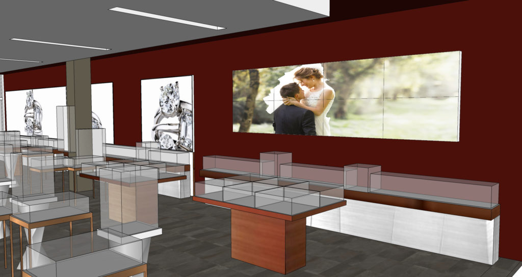
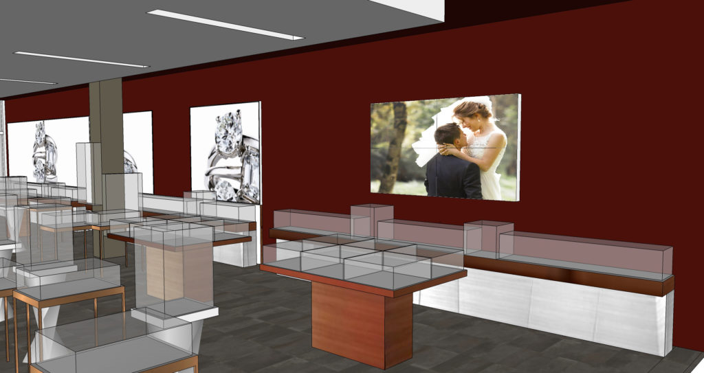
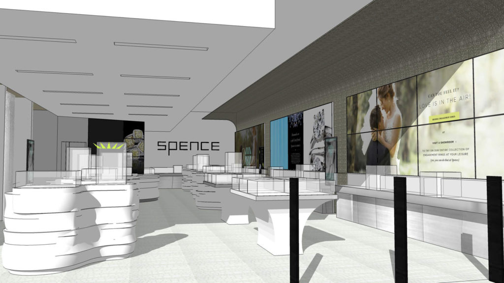
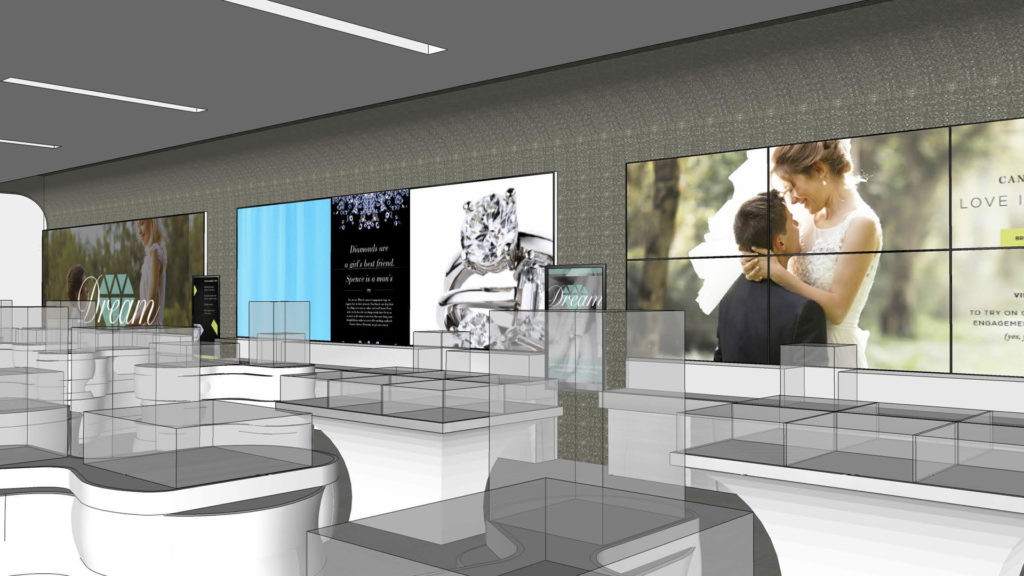
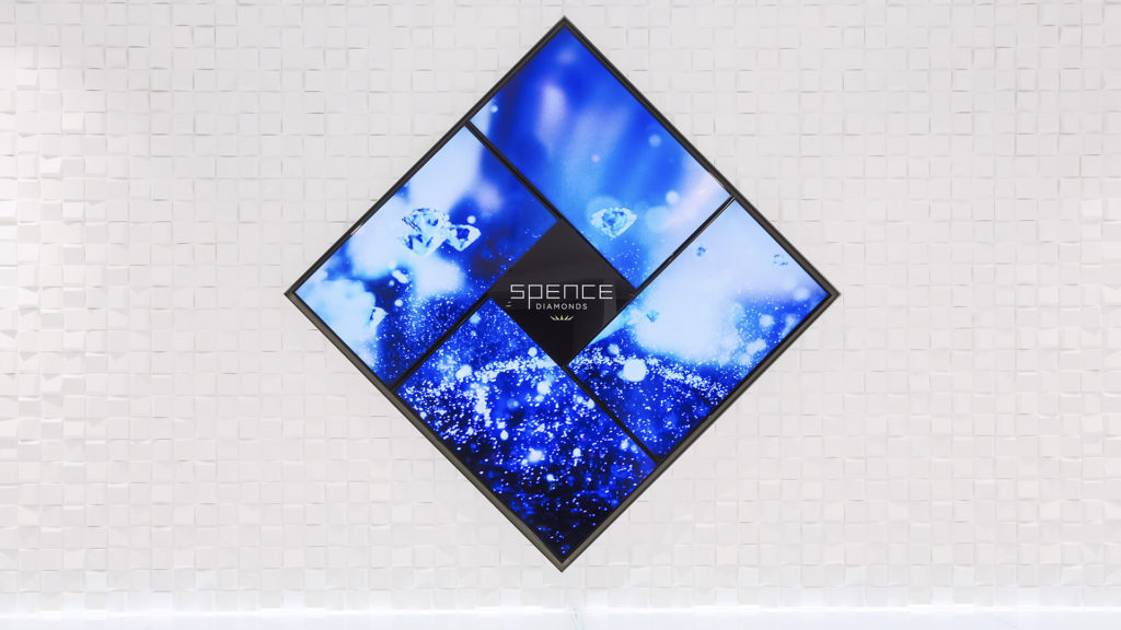
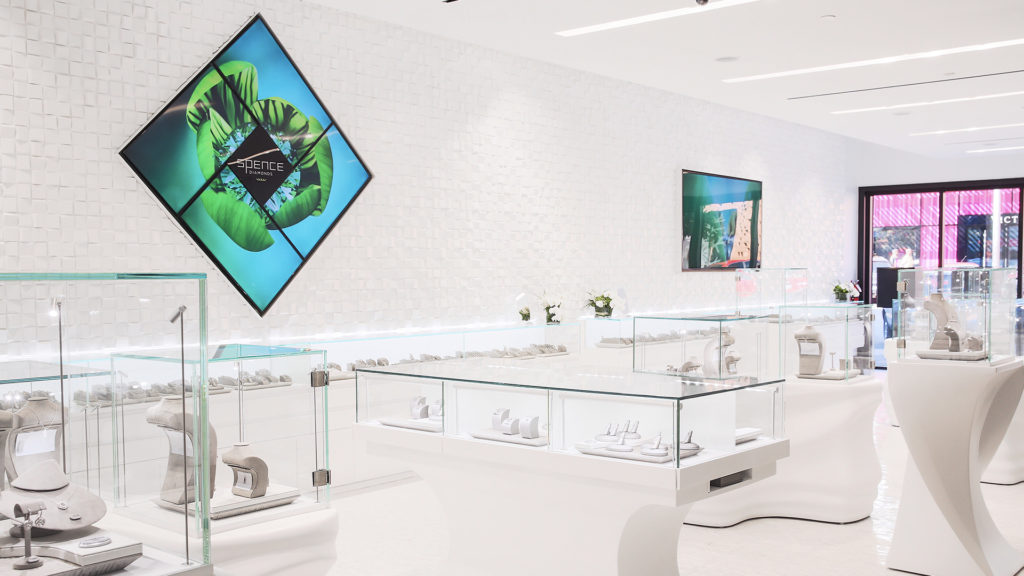
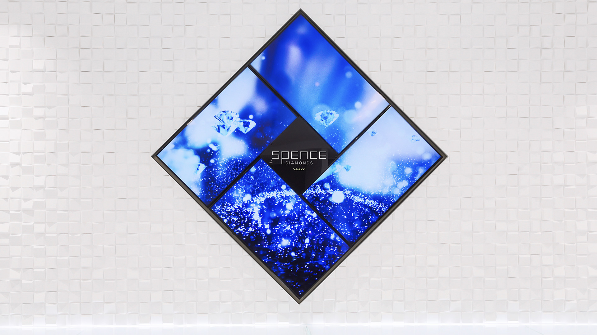
Secondly, because of all of the glass cases in the store, with all of the movement that would be emanating from the screens, it would cause the store to reflect and seem very busy. In coordinating with JGA, we discussed the solution being a bit ambitious. We instead decided to repeat the outward-facing diamond shape between two 85-inch 4k monitors all on a single wall.
Digital Language
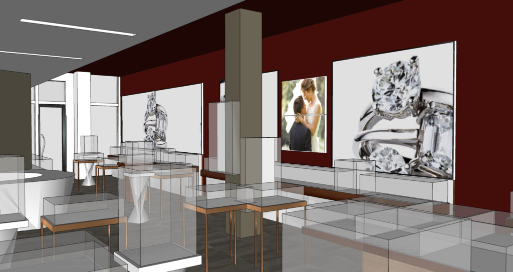
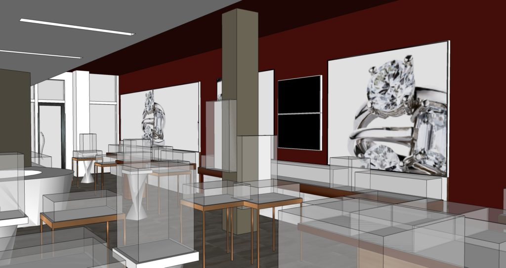
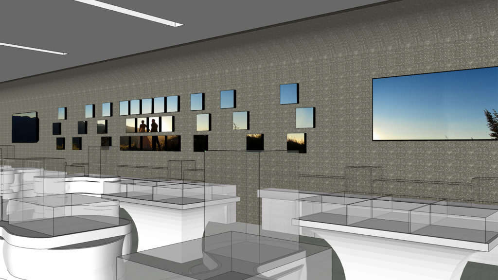
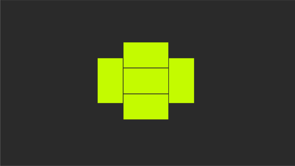
Street-Facing Screen Configuration options
Bridal Wall Mosaic Tile Configuration
We were able to program lighting cues that were triggered in the video content that played on screen. With edge-lit etched glass mounted in front of the screen a floating Spence logo exists, and lights up or remains a watermark on top of all of the environmental content. Because this screen has the longest sight line in the store, it was important to keep the branding visible at all times.
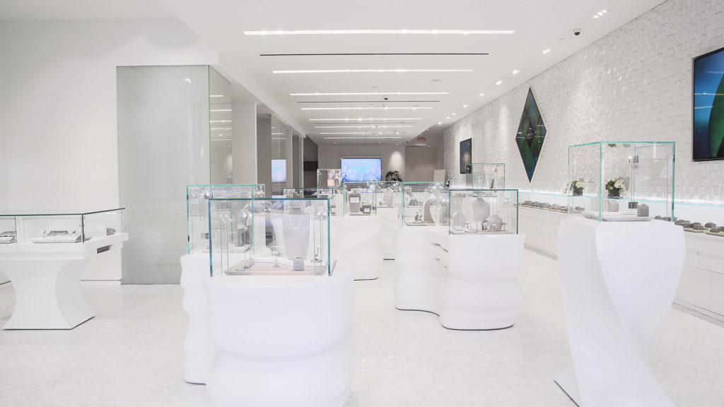
We divided the store into different zones – Window, Bridal Wall, Brand Wall, Lounge, and Consultation Rooms and created a content playlist plan for each.
The Window was to play environmental content to attract attention from the street.
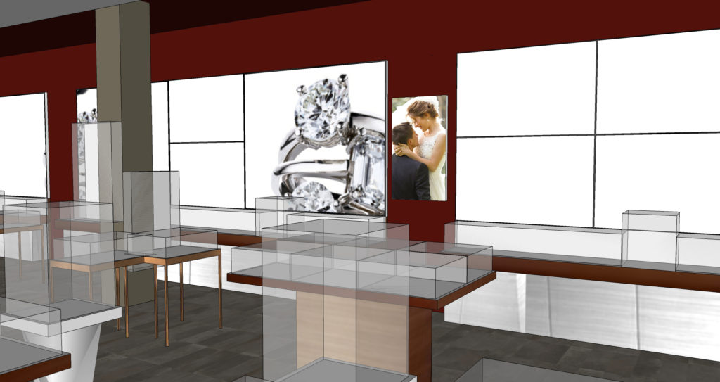
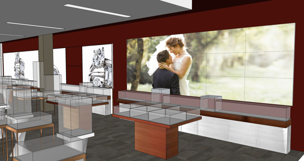
The Bridal wall could be used for season promotional and story-telling opportunities as well as environmental.
The brand wall would also be environmental content, with the color-changing logo floating in front.
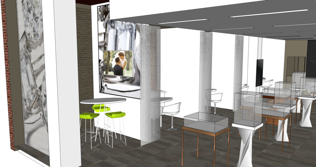
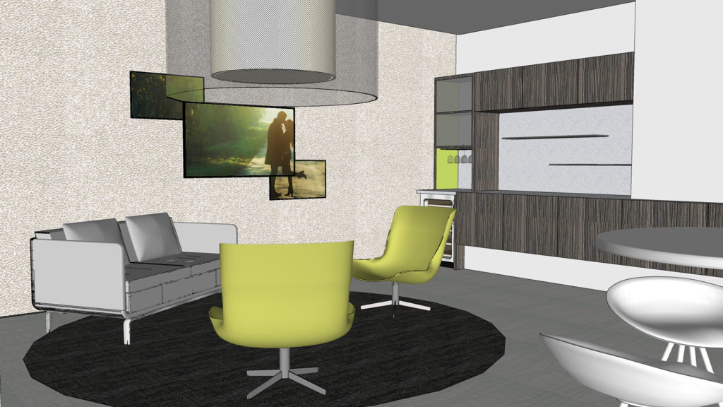
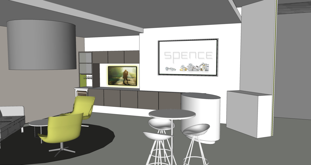
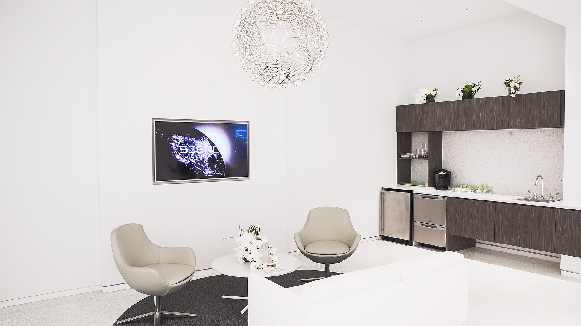
The Lounge screens are used for educational story-telling. They were accompanied with speakers for audio, while the rest of the store has speakers for ambience and music this zone was isolated and had the highest dwell times.
The Consultation rooms provided the opportunity for staff members to continue the brand story on demand by mirroring their tablets and mobile devices onto a larger screen for all to see.
Design and Content Planning
Design Results
This project won the 2017 DIGI Award for Best Digital Signage in a Retail Store
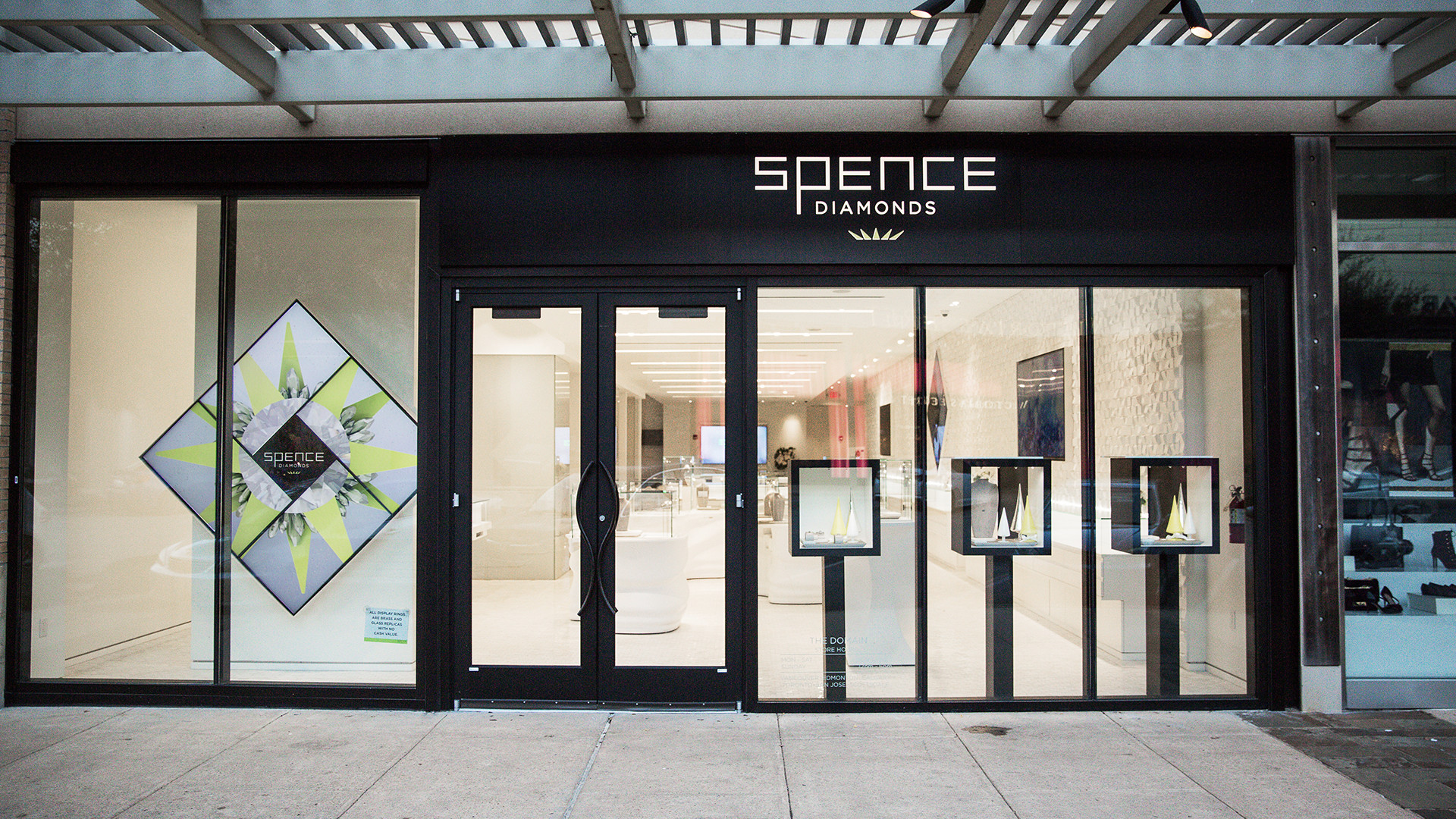
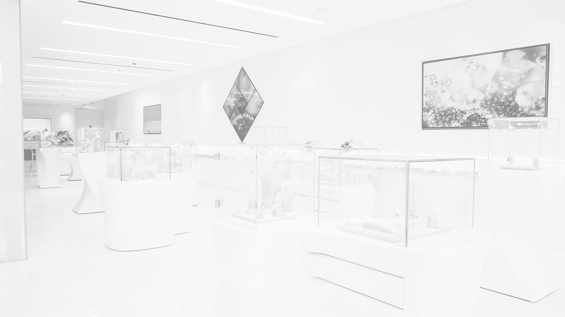
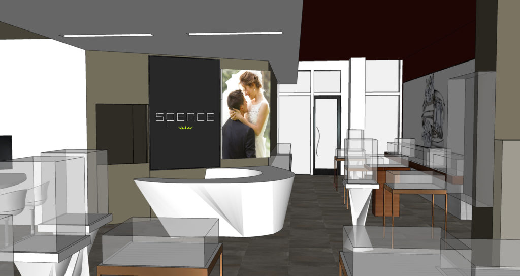
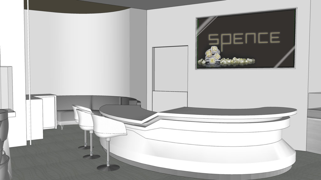
The Spence storefront makes a statement to those passersby
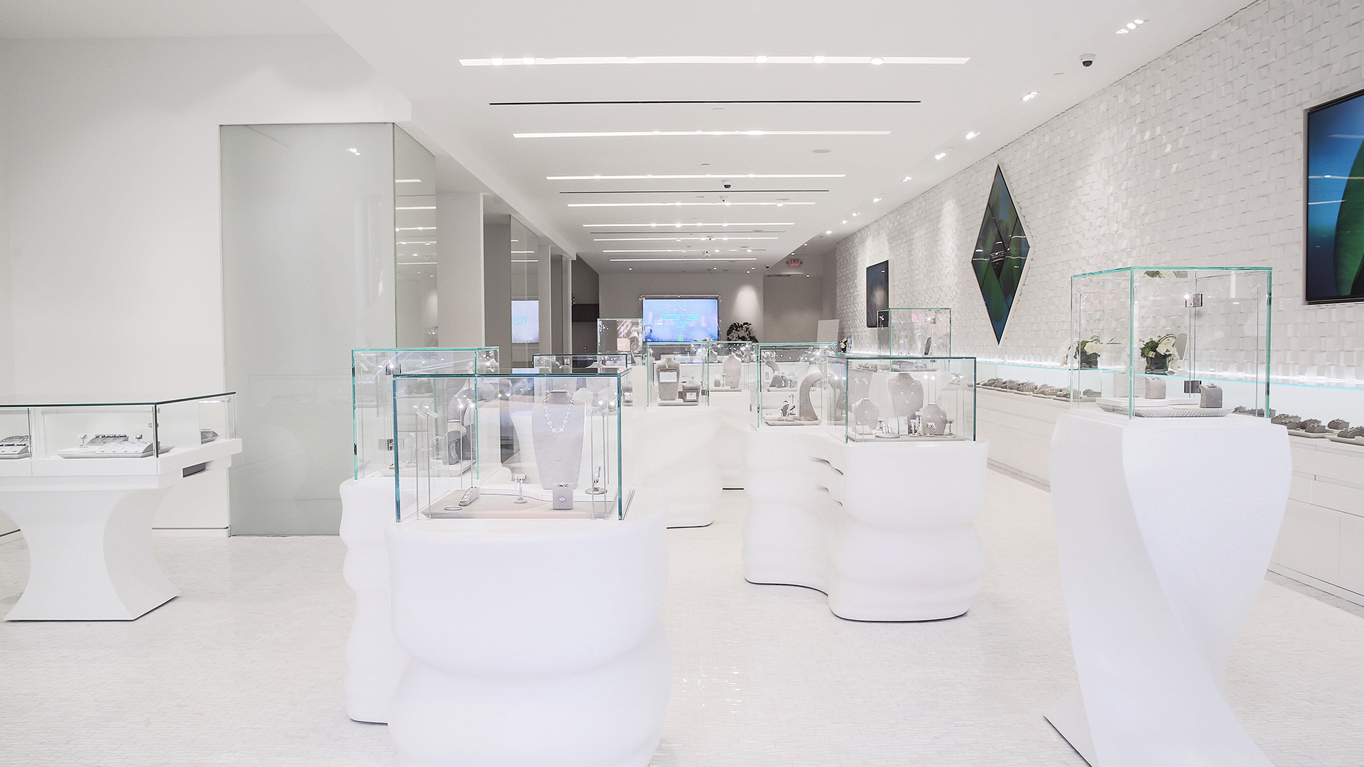
The entryway of Spence is clean, modern, and energetic.
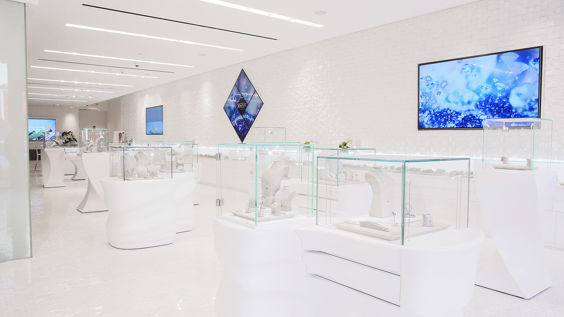
Two 4k screens and the Spence Diamond centerpiece create the mood for the entire store.
The centerpiece of the store is a reiteration of the window configuration

These screens have the unique opportunity to speak to customers from any angle in the store.
Visitors can grab a drink and see more about the Spence story while they wait on their significant other to shop