BACKGROUND
A Dated Marketing Site Provided Roadblocks
to a Growing, Digitally-Savvy User Base.
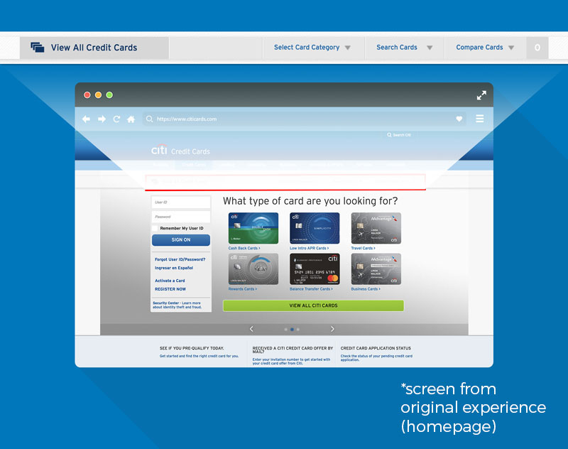
Citicards.com is Citi’s main marketing site for the credit card line of business, netting $3billion+ annually. In 2017, after 4 years of leveraging a previous design, my ux team was presented a sub-navigation element that was causing users difficulty in proceeding through any conversion flow.
APPROACH METHODOLOGY
Design Thinking + Agile Testing + Co-Creation + Usability Testing + UX Best Practices
The business owners had a simple ask to redesign one small piece of a user’s journey, but while creating the initial journey map, my team quickly discovered that this small navigation piece wasn’t a simple fix. The usability woes of the website extended far beyond solving the initial ask. There were many aspects of a user’s journey contributing to frustration stemming from the dated site design.
The Problem Must be Clearly Defined
Raw Data Gave Us a Start
A high concentration of users would come to the site and wish to compare cards but when presented with an empty cart upon clicking 'Compare Cards', users would either bounce or click 'View All Cards' as a second option. A redesign of this secondary navigation was requested based on user data, with the end goal of making it easier for users to jump into a acquisition flow. My team was not sure that this solution would solve the bigger problem of user frustration, so we took a step back and began asking questions around user intent.
Ask Why, Early and Often
Design Thinking to Solve a Problem
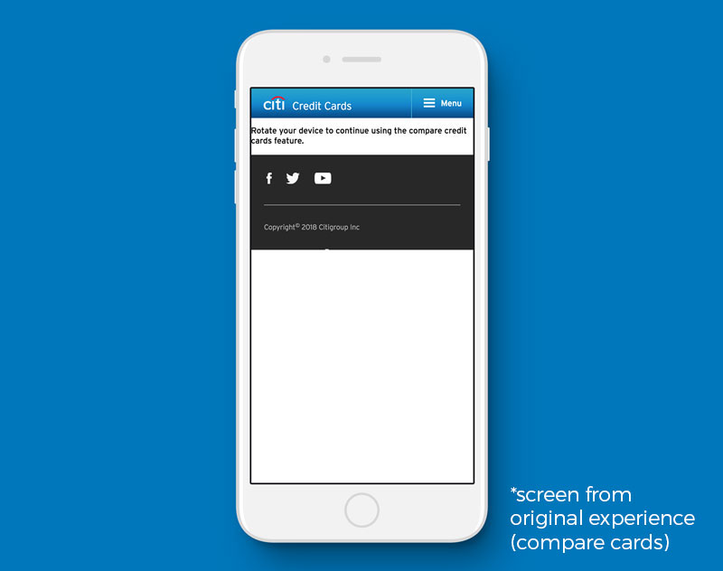
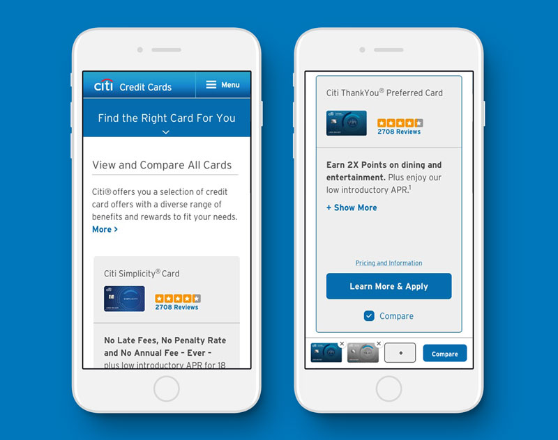
When asked, users answered questions on their intent of clicking these CTA's, the resounding answer was 'I want to find cards so that I can either compare side-by-side and narrow my search' or 'I want to browse all card offerings.' No matter the stage of consideration, users found the site difficult to navigate and lacking the functionality they needed to make a decision. Mobile users were almost completely left in the dark when it came to comparing cards, as the experience only responded down to tablet. So the mobile experience instructed users to rotate their phones, but was still unusable on 65% of phones.
Reframe the Problem
Iterate for Solutions
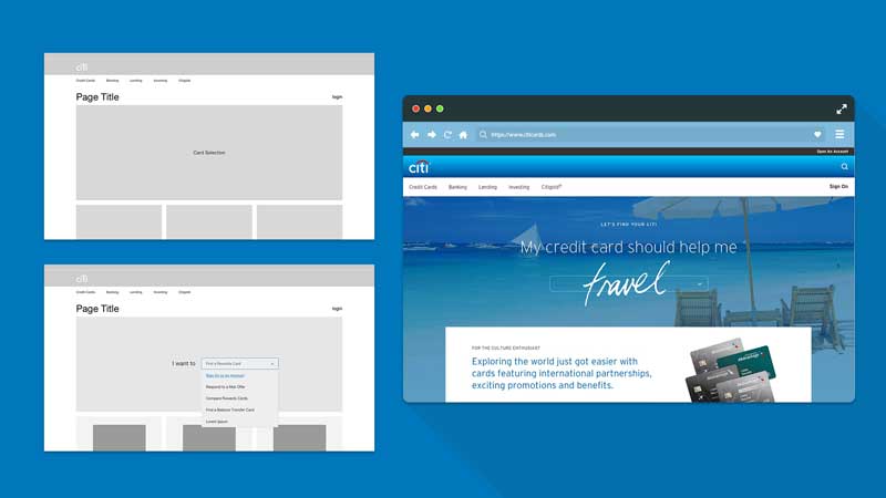
With our initial design thinking sessions, we developed a design and content strategy with which we were able to pitch to business and successfully expand the scope of the request and introduce to the roadmap a fully responsive MVP of the entire site. This effort included Product Listings, Product Description Pages, Side-by-Side Comparisons, Homepage and redesign of a few key adjacent pages that would also land users into the main experience flow. Creating the cohesive experience across platforms was important to our users, even though mobile was more commonly used for research and desktop for the actual conversion.
Designing with a Collaborative Philosophy
Teamwork Makes the Dream Work
Along the way we've uncovered and escalated technical issues and restraints that weren't apparent to anyone prior to the larger effort, but will be improved alongside the experience design. We've also been able to drastically improve upon Citi's product team processes to think with accessibility and mobile mentality first. This wouldn't have been possible without collaborative design thinking sessions with our internal clients and stakeholders, including user testing results with every iteration and sharing ownership of the design process.
RESULTS & LEARNINGS
Failures + Iteration, Successes and Rollouts
While this project started off as a small scale ask with a quick turn time, seeing the potential at the get go was due to effective design thinking and strategy up front, and was continually reinforced by leading the team with optimism in collaborative efforts. A low-hanging fruit is easy to write-off, but as we learned when you treat every task with importance, it will become even more valuable to the stakeholders, especially when you begin to see results.
Product Description Page
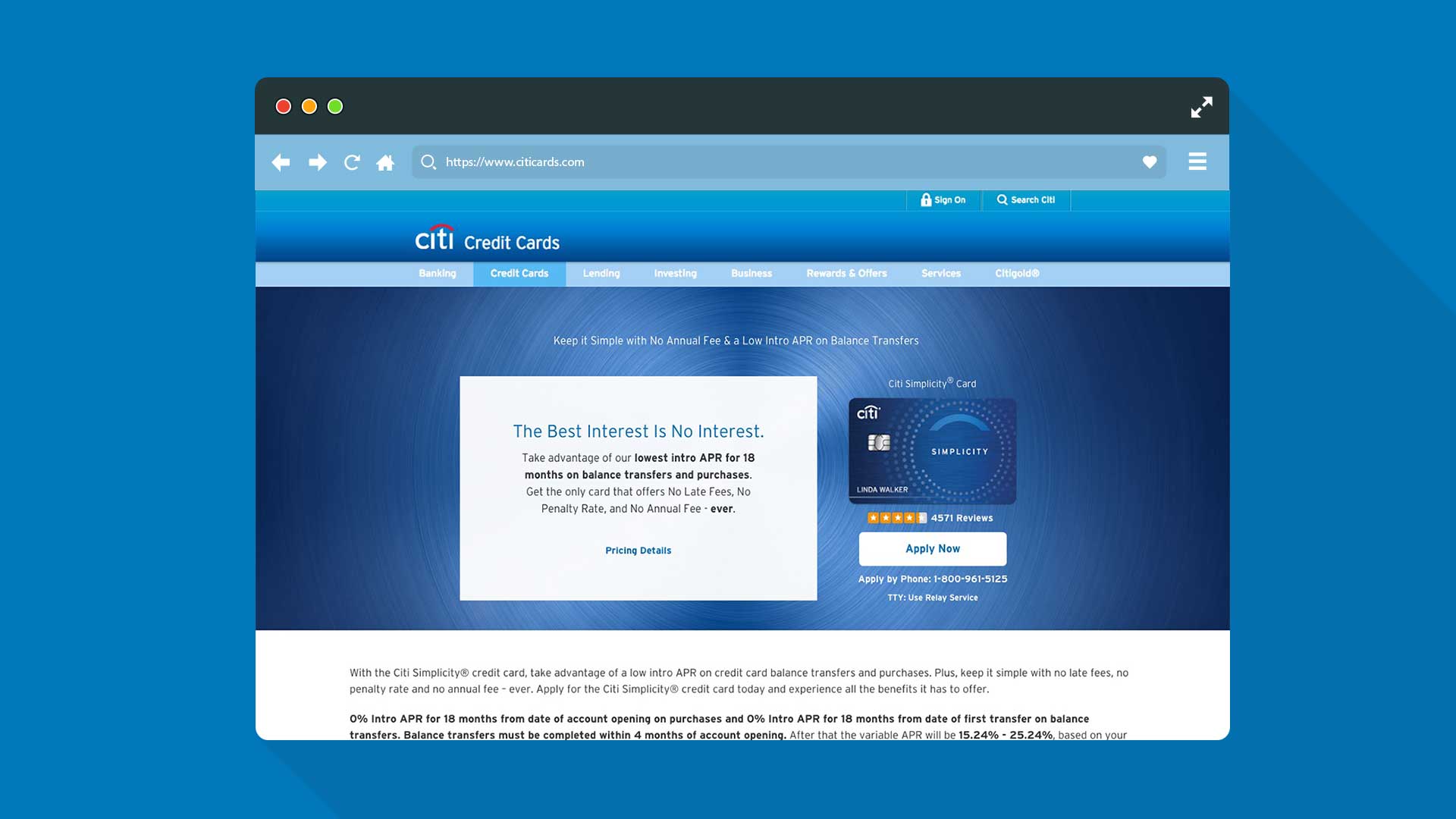
A scalable Product Detail Page (PDP) template with rich content and more branded opportunities made a huge impression on both the user and the product owners. Performing at +82% application rate (vs the previous design) at initial rollout and consistently +24% month over month, the message is able to come through loud and clear, and with more personality than ever. All 17 cards will receive similar MVP treatment in 2019, with a second iteration entering testing in Q2 of 2019.
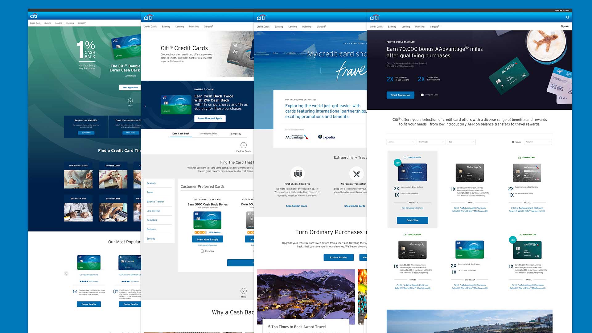
Homepage
The citicards.com homepage design is currently in testing. After two days of co-creation with users in different markets, and two full day work sessions with the stake holders we prototyped four drastically different stories to take into testing and find out how users truly intend to use the site. From relationship building to a hard-sell e-commerce approach, these homepage concepts offer best in class digital experiences for users while offering a glimpse of what a credit card company should be.
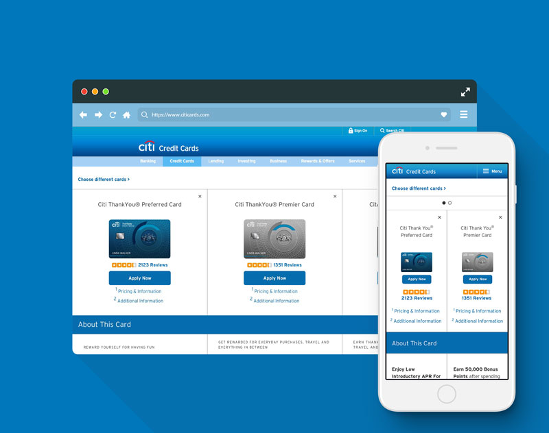
Side-By-Side Comparison
After some agile testing, and competitive analysis we were able to conclude that users prefer to see three cards side-by-side as a power experience on desktop, and were satisfied with 2-up view on mobile, with the ability to swipe and compare a third. As the current experience is lacking in mobile, this is a huge improvement in functionality by building responsively. Resourcefulness also played a huge role in being able to accomplish this experience, as we were able to leverage a previous experience built for another card micro-site, completed in early 2018.
Product Listing Page
The Product Listing Pages(PLP) currently have the highest traffic of any page, due to the amount of back-linking and specific SEO, which means users are most likely to land on these pages from a search engine. But because these pages can have 17 cards on them, their mobile experience can get tedious. We separated the cards by tile to create a familiar scrolling experience, as well as added the compare functionality on mobile. The platform of the current site is undergoing a conversion to Angular, so while that presented some limitations in design, we were able to negotiate with the tech team and design with forward compatibility in mind.
Visual Design: Rob Karlovetz and Rolf Nelson
Producers: Magen Stewart + Michael Baynton
Architecture: Dave Anderson and Rolf Nelson
Strategists: Lou Capone + Lauren Armstrong

